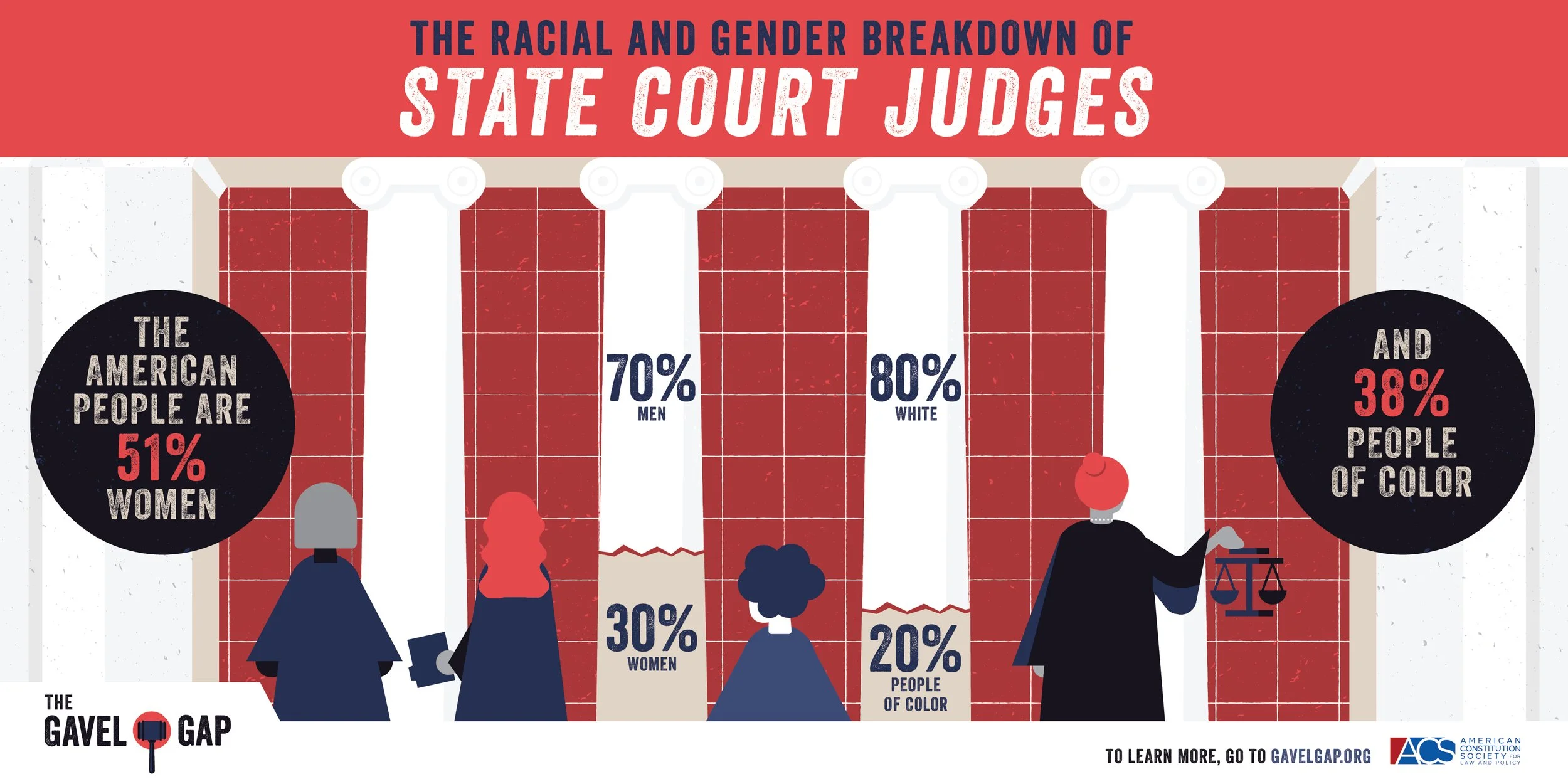
Researchers working with the ACS gathered information on the demographics of state count judges in all 50 states. What they found were huge disparities in the make-up of race and gender of the courts and the communities that they represent. This is called The Gavel Gap, and it's a big deal.
Chi/Donahoe reached out to Michelle LeClerc to visualize this campaign. Before we knew it, we had designed a large body of work: 3 infographics, 1 logo, 17 illustrated frames, and a 28-page report.
The Report
The Gavel Gap: Who Sits in Judgment on State Courts? is a research-driven publication examining demographic representation across U.S. state courts and how judicial composition compares to the populations those courts serve.
The challenge was transforming a dense, data-heavy report into an editorial experience that felt approachable, authoritative, and engaging without sacrificing academic credibility.
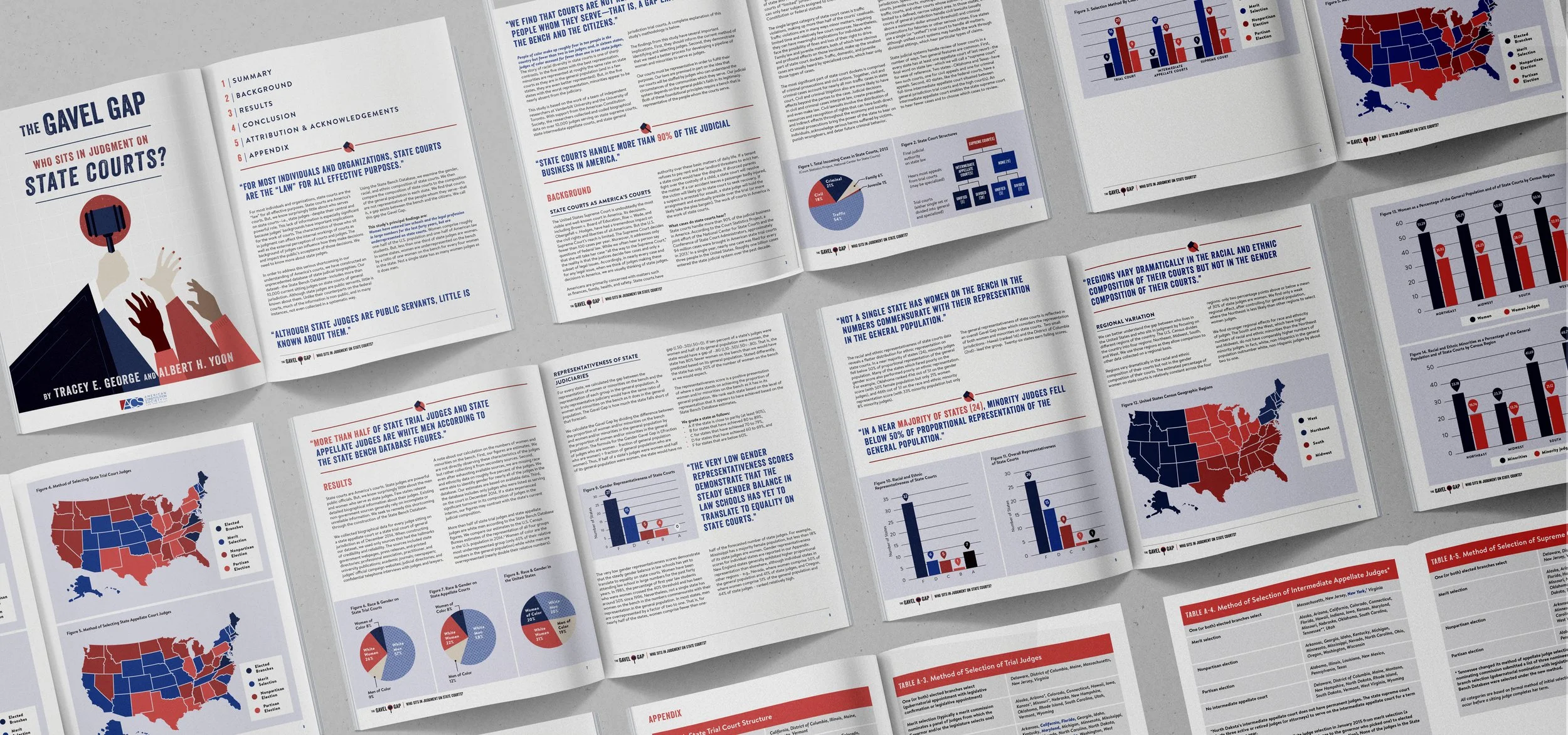
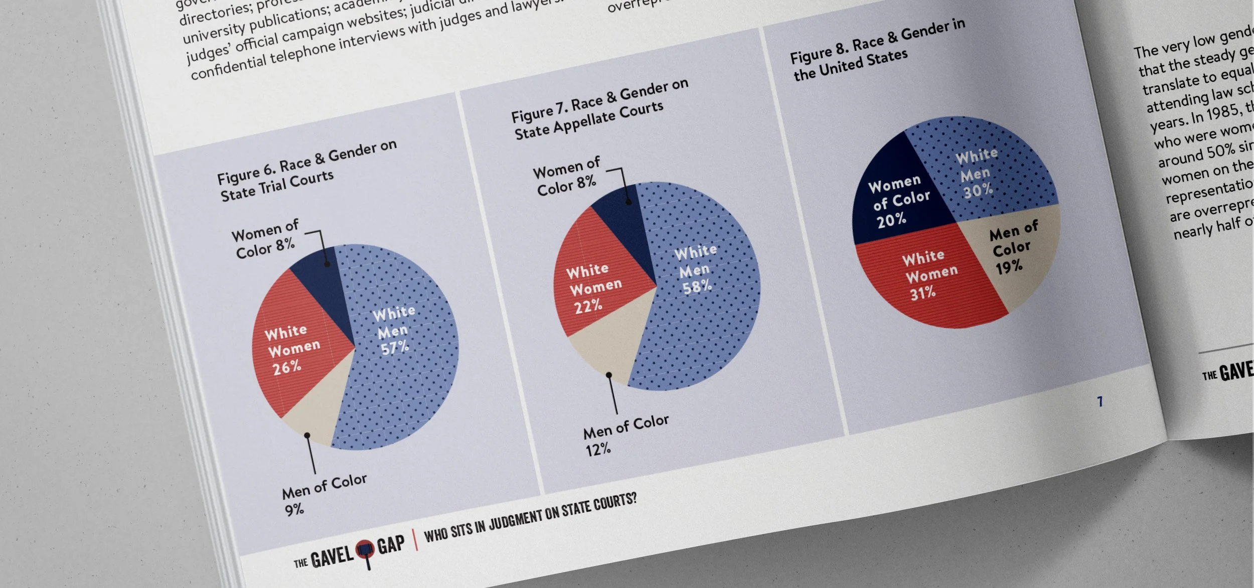
Data Storytelling
One of the primary goals was helping readers move between narrative and evidence seamlessly.
Maps, charts, and diagrams were integrated directly into the editorial flow rather than treated as separate visual assets. This approach allowed the report to communicate patterns and disparities quickly while preserving the depth of the underlying research.
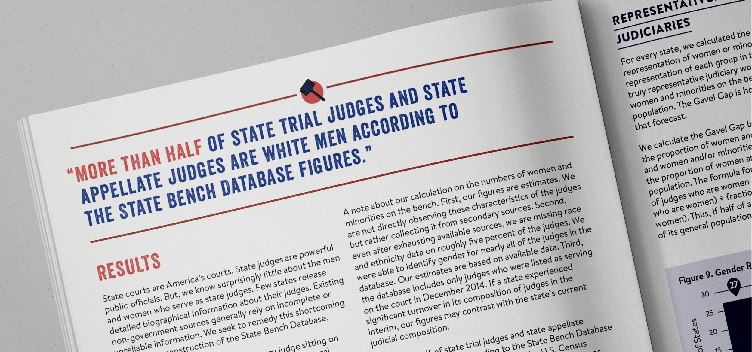
Pull Quotes & Editorial Rhythm
To improve readability and encourage engagement throughout a research-dense publication, I incorporated a system of editorial pull quotes that highlighted key findings and memorable statements from the report. These moments acted as visual anchors across the spreads, helping readers quickly absorb major takeaways while creating pacing throughout longer sections of analysis.
The Infographics
To increase engagement and retention, we integrated illustration directly into the data visualization rather than treating it as a separate visual layer. Human figures became part of the graph itself, turning demographic percentages into immediate, relatable comparisons. This approach helped make complex findings easier to understand at a glance while reinforcing the report’s core message through memorable visual storytelling. They are designed to be shared on social media and within news articles to increase the reach of the report findings.
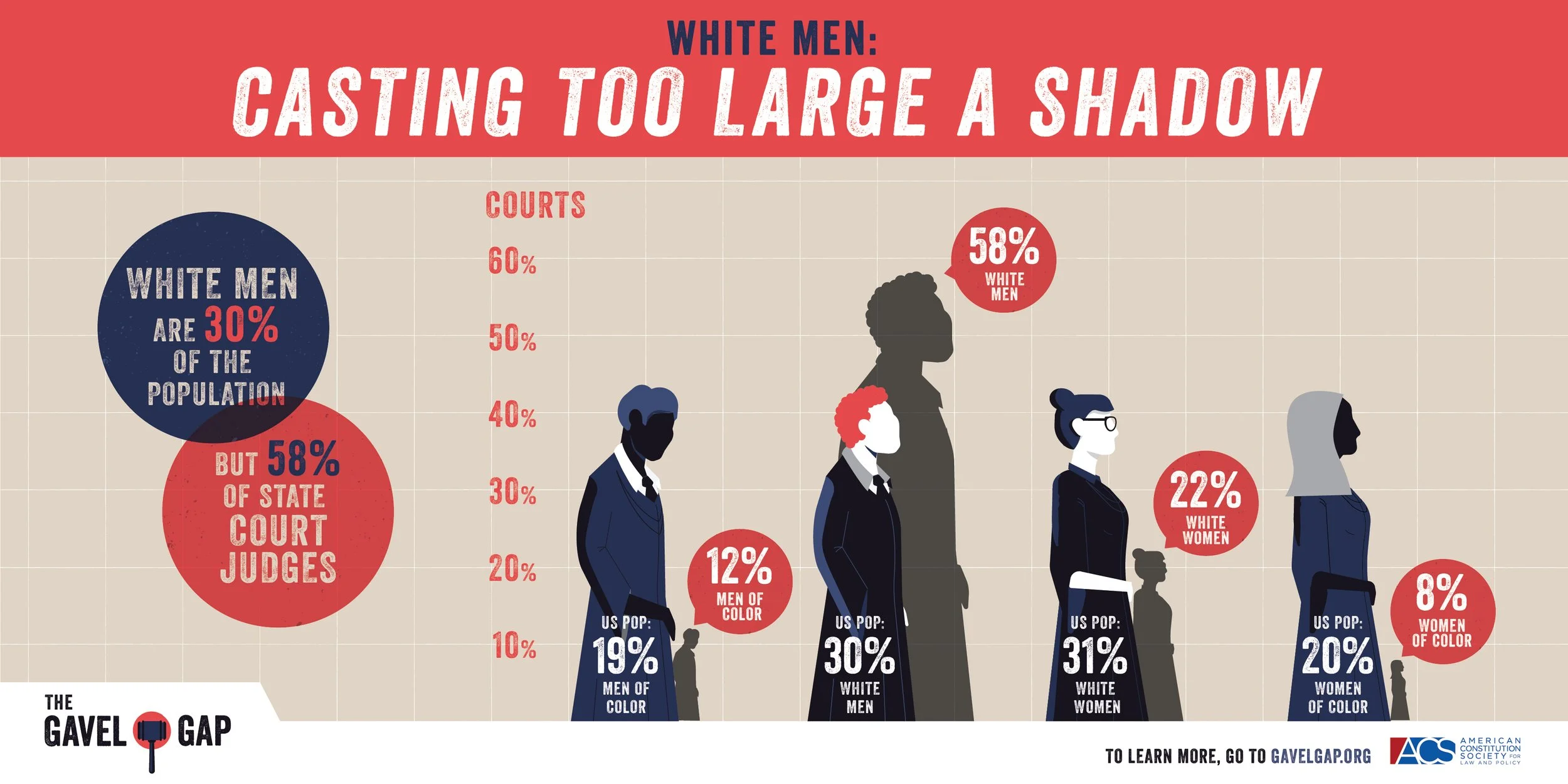
The findings added to the discussion of representation in the state courts and were amplified by several news outlets:
The Brennan Center for Justice