
EOS Outdoors Sub-Brand System
EOS Outdoors was created as a sub-brand identity system designed to translate the spirit of outdoor exploration into a flexible, recognizable visual language. The goal was to establish a brand that feels rugged yet refined—equally suited for product applications, environmental graphics, merchandise, digital experiences, and future brand extensions.
The identity needed to balance adventure and utility while maintaining enough structure to scale across touchpoints.
The Challenge
Outdoor brands often lean heavily into either technical performance or lifestyle storytelling. EOS Outdoors aimed to create a middle ground: a system that captures the emotional experience of being outdoors while remaining clean, contemporary, and adaptable.
Brand Positioning
EOS Outdoors is built around the idea that exploration is both physical and personal. The identity embraces moments of movement, discovery, and connection to landscape.

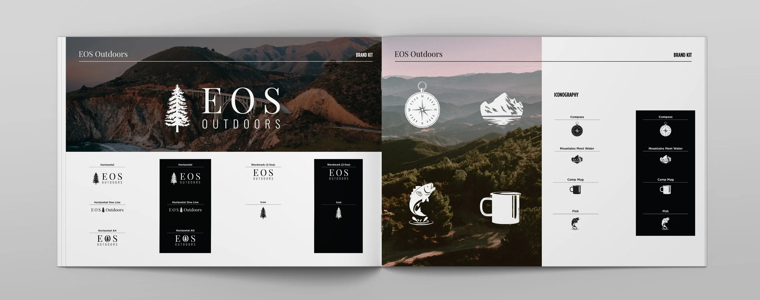
Iconography
A custom icon set extends the identity and creates moments of storytelling across applications. Icons represent recognizable outdoor experiences and objects:
Compass → navigation and discovery
Mountains → landscape and destination
Camp mug → ritual and community
Fish → recreation and connection to nature

Art Direction
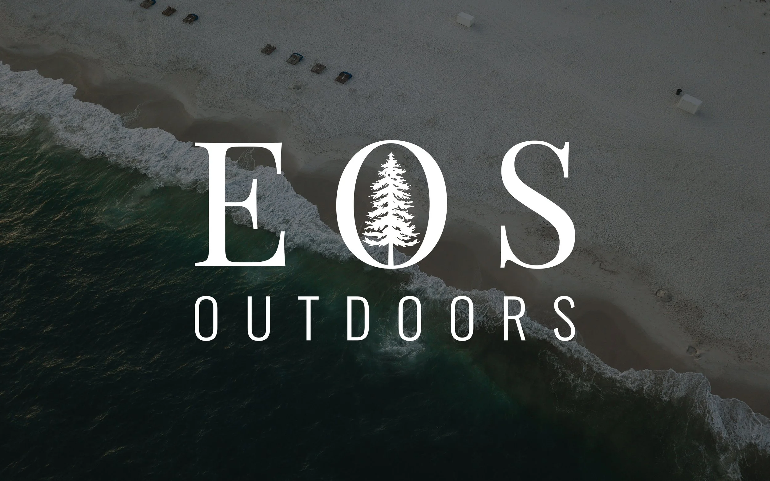
Photography emphasizes atmosphere over action. Muted landscapes, layered terrain, and cinematic lighting establish a sense of place while allowing white brand elements to remain prominent. The restrained color treatment supports a premium outdoor positioning and gives the identity longevity across seasons.
The final system delivers a cohesive sub-brand identity that can evolve across packaging, merchandise, retail experiences, and digital channels.
EOS Outdoors establishes a recognizable visual language built on modularity, restraint, and outdoor storytelling. It creates a foundation that supports future growth while maintaining a strong sense of place.